Project Summary
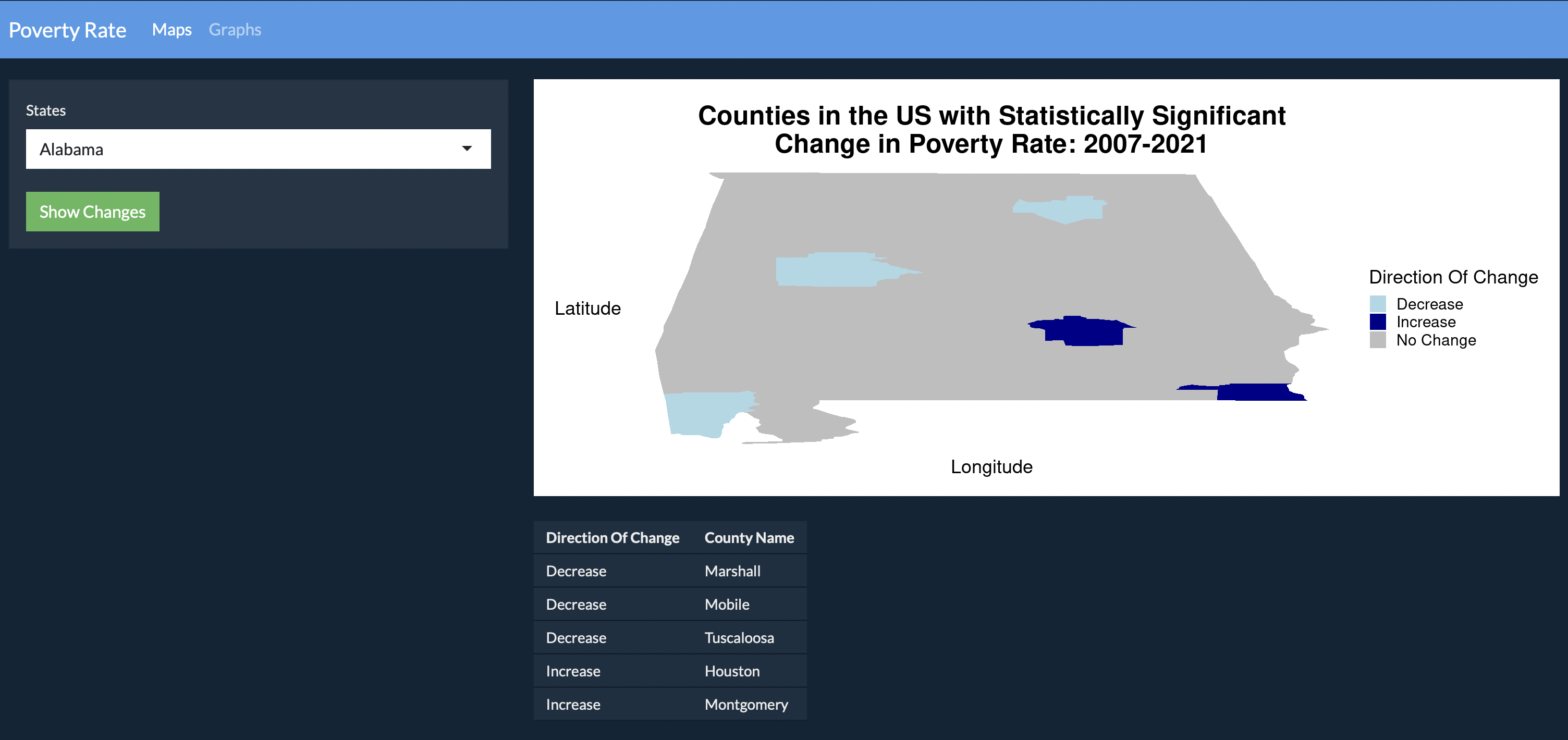
The RShiny app shows statistically signigicant changes in Poverty Rate of US Counties from 2007-2021. The app allows a user to select a state so that the user can see the map of the state with the change in the poverty rate in the county (increase or decrease) highlighted in the map. Additionally, the app allows a user to compare the changes in different counties using a bar graph with the option to stack the changes or fill the bars at the same height.
The Shiny app can be found here.
